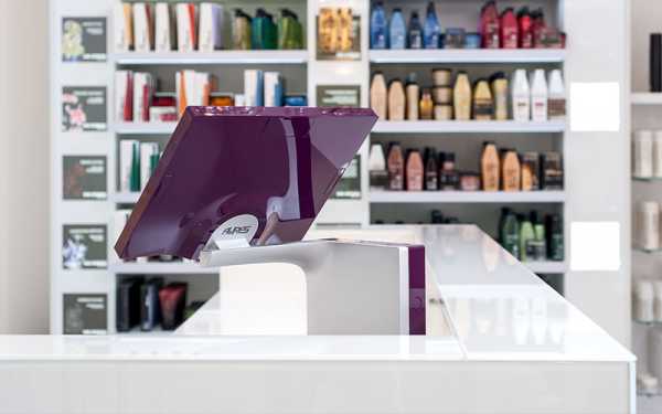
Too long neglected in terms of design, look and even ergonomics, POS systems have now become strategic elements of the point-of-sale commercial and marketing environment.
Functionalities and technological innovations are no longer enough; beyond the purely technical or user- and consumer-friendly aspects of POS hardware, retailers now want to be in a position to choose elegant IT equipment, with real design features and sometimes new colors, to harmoniously accompany their brand image and style.
At the end of the in-store consumer journey, the checkout will round off the customer’s shopping experience and be a key contributer to customer satisfaction, at a very special moment, when concluding purchase and payment.
The POS checkout is therefore a highly tactic and strategic spot both for brands and their staff, but also for the consumers who complete their customer experience there.
For the point of sale
Store layout requirements and point-of-sale marketing and merchandising have now become a must for many shops and retail brand names; this is true not only in large chains or high-end luxury boutiques, but in most sectors, including hotels, restaurants and services.
Nothing today is left to chance and brands now spend on average between 1,000 and 5,000 USD per square meter (2017 POPAI survey) to “revamp” their stores and modify or improve their brand image and visual identity; this in order to keep a volatile and increasingly demanding clientele, especially as the offer is now so broad and varied.
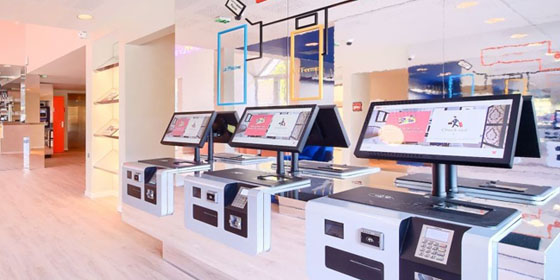
The till point or lines are now a complete part of this global thinking process at the POS ; the major design agencies have fully understood the trend and have all integrated a dedicated “retail design” department to address the segment. They‘ve turned into full-fledged key influencers in the field of POS technologies and want to ensure that the latter perfectly match and highlight the style and identity of the brands, while blending perfectly into the decor.
Goodbye to bulky grey or black POS boxes with disgraceful dusty cables!
Welcome to ergonomics and user friendliness, to contemporary designs and lines, to quality materials and features, to elegant details and finish (outside and inside the hardware) and to new modular colors.
And let’s also remember that a “nice” POS design rarely costs more to the end user than a “zero design” one…
For staff and users
The advantages for store staff are obvious; all acclaim innovative and easy-to-use hardware that simply looks good and can harmoniously match the POS style, from A to Z. In regards with the comfort at the checkout and the quality of the customer relationship, it has become essential for them to work with reliable and efficient POS equipment, but also pleasant to touch and to look at.
For the Consumer
Brand names cannot achieve a high level of customer satisfaction if the completion of the purchase and the payment at the till becomes a nightmare for the buyer.
The rise of online commerce and social networks is pushing brands to review their in-store and omnichannel strategies and to do everything possible to ensure that their “brick & mortar” store is and will remain an attractive place for their consumers’ shopping experience.
For the Customer Journey
Today, almost all retail brand names aim to place the Customer at the core of their strategy and have substantial budgets to perfect the now famous “customer journey” (or Buyer’s journey).
Purchasing behaviors and habits, in-store perception, expectations and criticisms… all these data are carefully reviewed and analyzed to optimize the efficiency of all sales processes, satisfy and retain consumers and keep on winning new ones.
It is thus no longer possible for retailers to accept that the checkout and the POS’ perception and experience, which complete the customer’s “instore” journey, should undermine all the marketing and financial efforts made to make the most of it.
Once ignored, design, style and colors are today everywhere and at the centre of retailers’ concerns and interests; they are now massively investing to assert their brand image and visual identity at the point of sales and at the checkout.
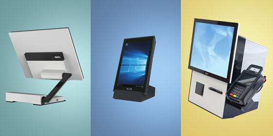
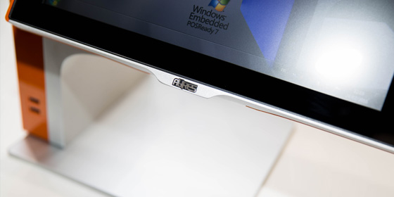
As early as 2005, the AURES Group positioned itself as a pioneer and placed POS systems at the heart of the store’s décor, style and brand image ; thanks to the addition of true design features and elements, contemporary and colourful lines, this strategy meant a total break with the “no” design approach of the other POS manufacturers and their “black boxes only” proposal.
AURES thus led the way and literally reinvented the world of point of sale terminals; today, this design oriented strategy remains a strong element of our fundamentals, globally, as attested by the many Design Awards obtained in recent years for the SANGO terminal and for the SWING tablet, the AURES Mobile POS offer that we have already mentioned.

